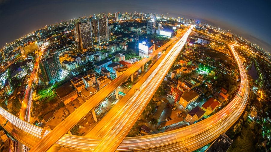
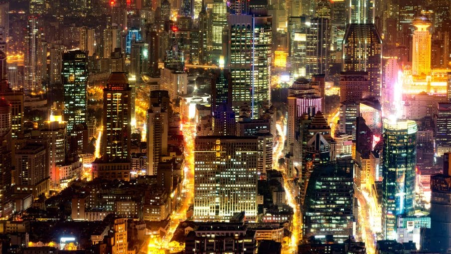
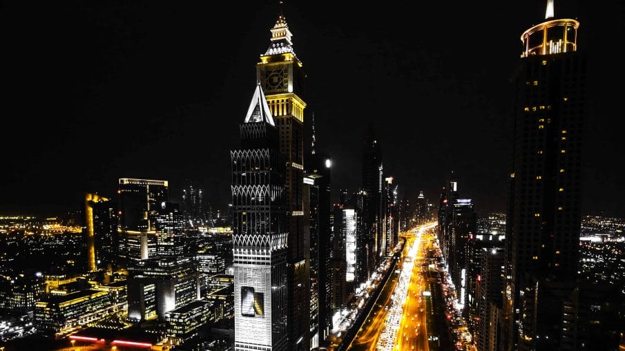
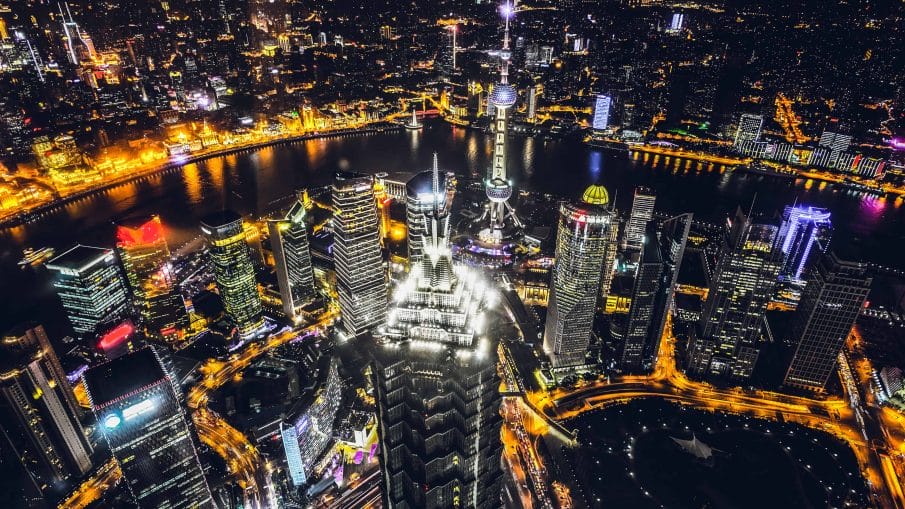
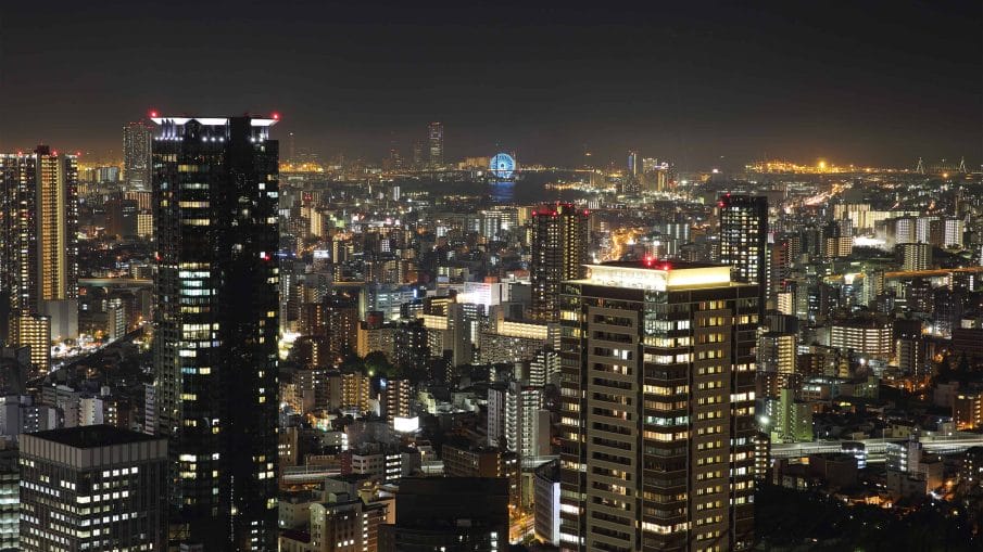
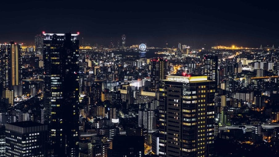
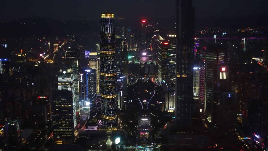
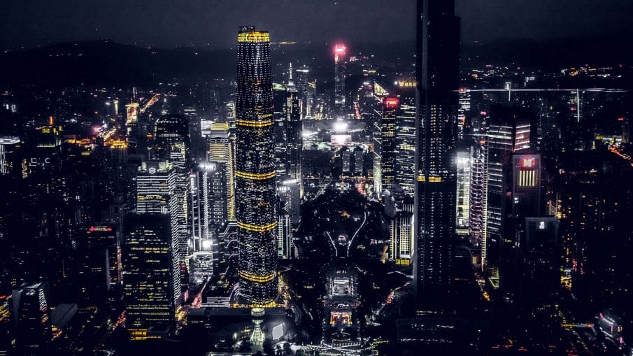
In this Lightroom tutorial, you’ll learn how to create the popular desaturated urban look that you see used a lot in night-time city and architecture photos. But instead of learning how to replicate a single look with very specific settings, you’ll learn the technique behind it so whether you want something subtle or strong, minimal or surrealistic, you’ll know how to customize the settings to get the exact look you want. You’ll also learn about a common Lightroom mistake that even professionals make. And it’s one of those mistakes that you don’t want to do because forces you do things backwards and slows down your workflow. By the way, if you only have Photoshop, you can still follow along with the Camera Raw filter. This is an easy tutorial so whether a Lightroom beginner or expert, you’ll have no problem following along.
Desaturating Colors
Let’s start off with the primary and most obvious effect; desaturating the colors. There’s two ways to do this. The first method is what most people do. Lower the vibrance until most of the image is desaturated and then increase it back up with the saturation slider. This creates contrast between the neutral and vibrant areas. Here’s a quick visualization of what’s happening when you do this. It’s the fastest, easiest and most common way to create this look.

Another way of doing this is to use the HSL sliders. It’s a little more work but it gives you more control. Simply desaturate all the colors around the blue and green range. You want to have a smooth change like this.

If you make sharp changes like this, you might get posterization or weird color artifacts. A lot of times, it’ll look fine in the photo that you’re working on. But when you copy it to other photos, the artifacts can appear. So to be safe, it’s always better to have a smooth transition in your settings.

Increasing Clarity
Another characteristic of the urban desaturated look is the clarity. Simply increase the clarity to your liking. If you go too high, you might get halos around the edges. Some people like this look and others don’t so it’s up to you how much clarity you want to add. By the way, whenever you’re trying to replicate a look and you see halos around edges, it’s likely the clarity setting. So keep that in mind any time you’re trying to replicate a look.

Adjusting the Tones
Next, we’re going to adjust the tones and bring out more detail. You can do this by dropping the highlights and increasing the shadows. This gives a flat look and the brightness might change slightly. For example, if we just drop the highlights and leave the shadows untouched, it’ll lower the overall brightness. So to fix it, we can add more contrast and brighten it back up.

Now you’re probably thinking that we’re going to be doing this with the Exposure and Contrast settings. But that’s actually one of the most common Lightroom mistake. Why? Well let’s say you’re saving this as a preset and applying it to bunch of other photos. It’ll overwrite your exposure and contrast settings which means that you need to retouch your photos again. Imagine fixing the exposure for hundreds of photos and only realizing later that your preset overwrote everything you did and you have to fix the exposure and contrast all over again. That’s a lot of wasted time and effort.

So instead of doing that, use the tone curves. In Lightroom, the Tone Curves has two modes. I recommend switching to the Point Curve mode which you can do so by clicking this icon here. This mode will give you more control and precision.

To increase the exposure, simply add a point to the middle of the graph and drag upwards.

To add more contrast, add a point and create an S-curve like this. The curvier your S-curve is, the more contrast it’ll add.

Lifting the Blacks
We now have the bulk of the urban desaturated look. The last thing to do is to lift the blacks. There’s several ways to do this but first, let’s get the terminology straight because people mix it up all the time. Lifting the blacks means making the dark areas brighter like this.

Crushing the blacks means making the dark areas even darker and you’re also cutting off the details in those areas.

You can also lift and crush the blacks at the same time which will look like this.

Whatever look you want is up to you but that’s how you do it. The more you drag it towards the center, the stronger the effect will be.

Another popular effect is to tint the shadows blue. To do this, go to the blue channel and then drag the bottom-left node upwards like this. You can also add a node like this to adjust where the blue tint gets cut off.

Here’s how the image looks like before and after.


Another common way to tint the shadows is with the Split Toning adjustment. It’s easier if you don’t know how the tone curves work but the results aren’t as strong and it gives you less control. Lightroom also isn’t the fastest software out there so if you have a large catalog, it’s good practice keep your develop settings minimal by doing everything you can in the tone curves.
Examples
Here are more examples of what you can create with this technique. We used the Tone Curve a lot and if you’re not familiar with it, I have lots of videos about it. In my opinion, it is the single most useful adjustment to learn because you can do so much with it and it’s also in other software like Photoshop, Adobe Premiere, and even the Lightroom app for iOS and Android.
