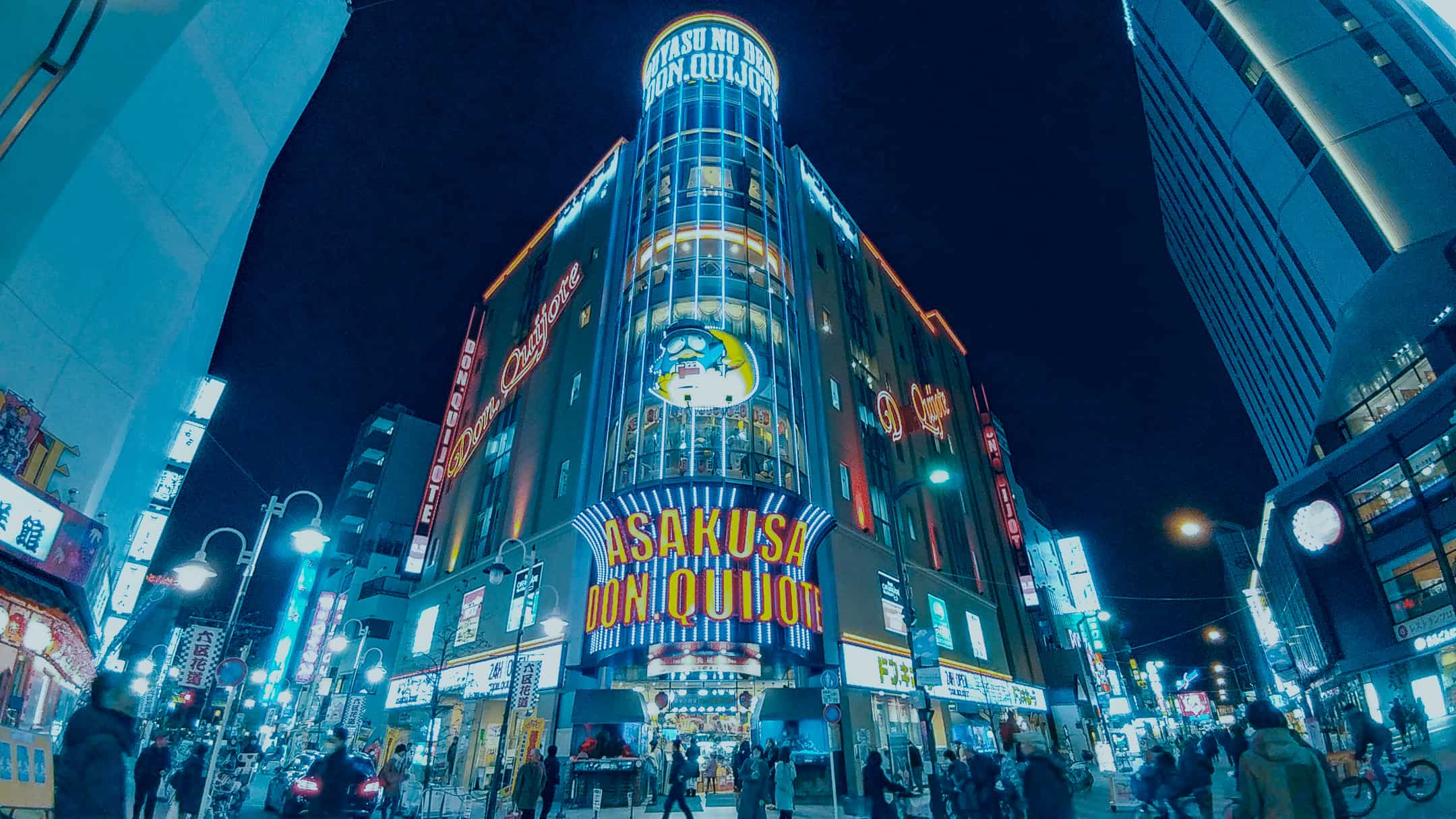
Learn how to replicate a really interesting color grading that is made specifically for nighttime photos. This tutorial is based on a request from one of our viewers who asked how to recreate the look from Tom Blachford’s Nihon Noir project. I really like the look and if you like to shoot nighttime cityscapes, then you have to try this out. By the way for those of you who are new to my channel, if you have any request, just leave a comment below and I’ll take a look at it. Anyways, we’re going to be replicating this look with just the calibration and tone curves. There’s also free Lightroom presets and profiles you can download.
Midnight Lightroom Presets
Before we begin, I just want to let you know that you can download three free Lightroom profiles and presets inspired by this effect. The Lightroom profiles will only work with Lightroom CC and you can adjust the opacity from 0 to 200%. You’ll also get Lightroom presets that will allow you to edit the settings and they’re compatible with older versions of Lightroom.

There’s also a Pro version that you can upgrade to. First of all, thank you so much for your support if you upgrade to the pro version. I appreciate it very much. In the Pro version, you’ll unlock all of 14 Lightroom profiles and presets that I’ve personally styled to give you a good variety of effects to choose from. In addition, the Lightroom presets are fadeable so that you can pick something lighter or stronger. There’s also a preset toolkit that will let you adjust the intensity of the blue tint and color intensity.

By the way, all of these Lightroom presets are compatible with LR Toolkit. LR Toolkit is a workflow system that’s also great for modifying presets to get the exact look you want.

But whether you use these presets or not, I still highly recommend that you follow this tutorial because it’s going to be a great learning experience.
Color Shifting with Calibration
First, we’re going to use the Calibration settings to shift the colors and essentially create a simpler color palette. To do this, scroll down all the way to the Calibration section.

Start by setting the Green hue to +100. Then, set the Green and Blue saturation to -100. This will desaturate most of the colors except for the reds.

To make the reds pop, set the red saturation to +100. Now your photo should have a simpler color palette that emphasizes the reds.

Creating the Blue Tint
Next, we’re going to add the blue tint. The easiest way is to do it in the Split Toning section. Simply set the hue to 220 and saturation to 100%.

But there’s also another way which will give you slightly better results and it’s also very easy to do. If you don’t know how to use the RGB tone curve, I highly recommend learning it because it is one of the most powerful and useful tools you can learn.
In the Tone Curve section, make sure that you’re in the point curve mode which you can switch to by clicking on this button.

Switch to the blue channel and lift the bottom-left node upwards which will tint the shadows blue.

Next, switch to the Red channel and drag the bottom-left node towards the right until your shadows turn blue. And you can go back and forth between the red and blue channels to fine tune the effect.

Finally, if you want to give your photo the dim look, switch back to the RGB channel and drop the top-right node.

To brighten the midtones but still keep that dim look, just add a point to the middle and drag it upwards.

To add contrast, add a node in the shadows here and drag it downwards to create an S-curve.

And you’re done. Here’s how the image looks like before and after.


More Examples
Here are some more before and after examples with some different variations. What you just learned in this tutorial is just the starting point. There’s a lot more you can do to customize it towards your style. I recommend that you play around with the other settings, especially the vibrance, hue, saturation and luminance. Don’t forget to download the free Lightroom presets which you can use to see what I’ve done to create different variations.


Thank You
Thank you so much for reading this tutorial and/or watching my video! You might have noticed that we created this very strong effect with very few settings. And that’s something that I’m always trying to show people – that you don’t always need to bring your photo into Photoshop or use a ton of develop settings. It’s always better to keep your edits simple.
If you have any requests, just leave a comment below with links to some examples and I’ll check it out. But if you want to learn how to decode other people’s effects yourself, check out my two-part series on how to to replicate looks. Part 1 will teach you how to replicate tones and part 2 will teach you how to replicate colors. It is the same technique that I use in most of my tutorials including this one that you just read.
Really great tutorial. Thanks for taking the time to explain things in such great detail in a way that is easy to understand.