The tone curve adjustment is seriously powerful tool that lets you create a lot of different photo effects. But it’s also very hard to use. In this tutorial, you’ll learn my secret trick to using the tone curves which makes it easier to use and it’ll give you better results at the same time. I’ve used this technique to create hundreds of Photoshop actions and Lightroom presets and if you’ve ever used my products, you’ll know much I depend on it to keep things minimal and less CPU intensive. Today, I’ll reveal to you my secret trick – the tone chart.
How the Tone Chart Works
Let’s start by seeing how this technique works. Here we have a tone curves adjustment. The tone curve is in my opinion the most important and useful adjustment every photographer needs to know. You can nearly any photo effect with just this one layer. And it’s a universal skill that you can use in other software such as Lightroom, Capture One, Adobe Premiere, After Effects, and even a lot of Android and iOS photo editing apps.
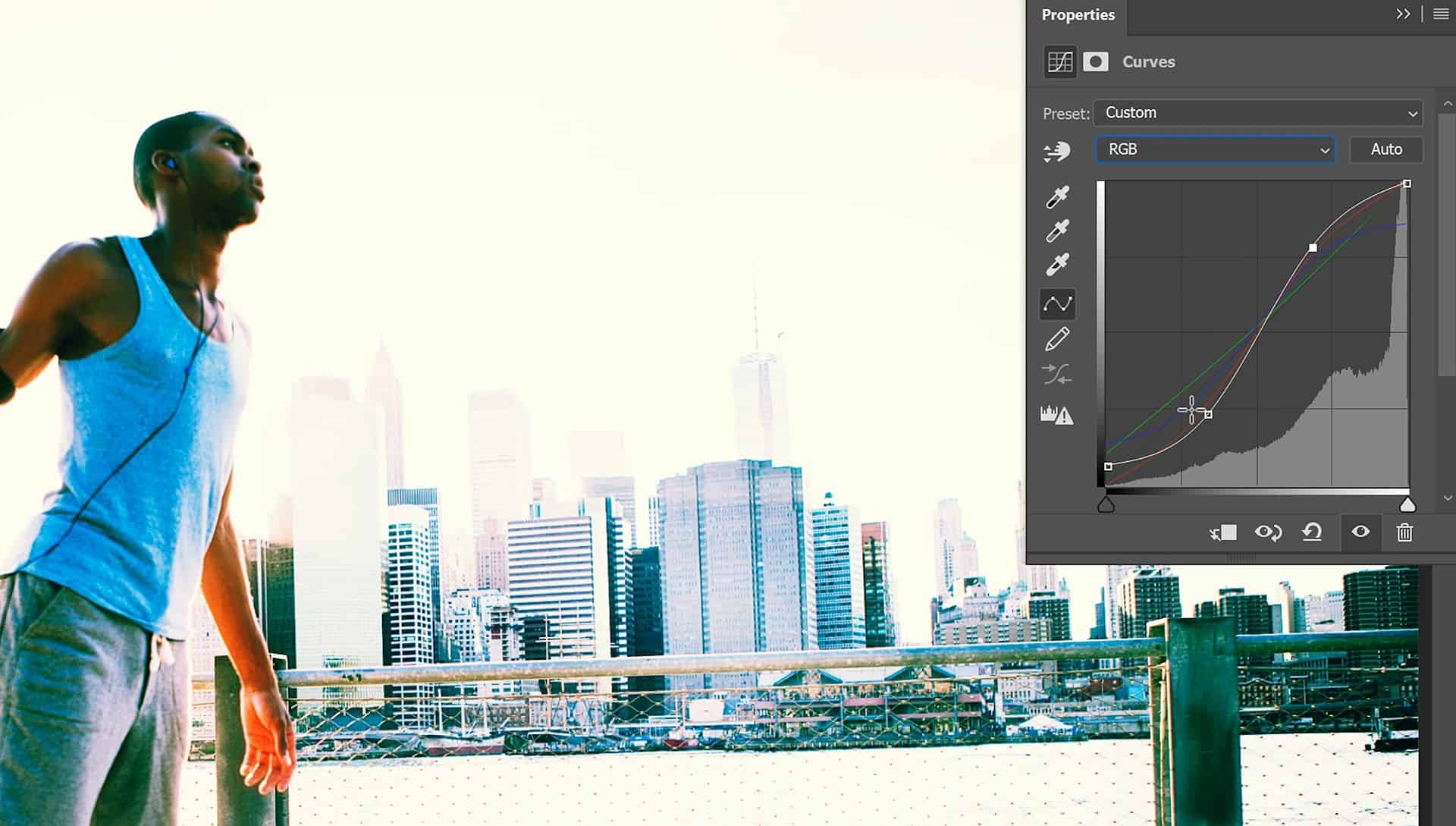
But the problem with the tone curve is that it’s not intuitive at all. A lot of people don’t know how to use it and for the people who do, most of them only know a couple tone curve shapes but they don’t actually understand what’s happening or why certain shapes create certain effects.
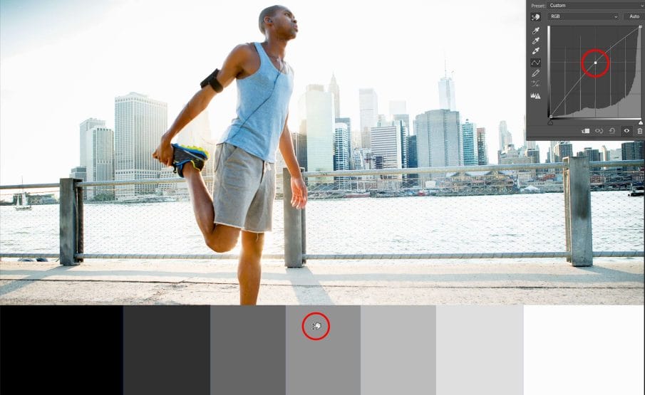
So instead of guessing your way around the tone curve, let me introduce you to the tone chart. Using the tone chart, you can change the tones in your photo simply by targeting specific tonal areas on this chart like this. It makes adjusting the curves a lot easier and it also lets you see exactly what’s happening.
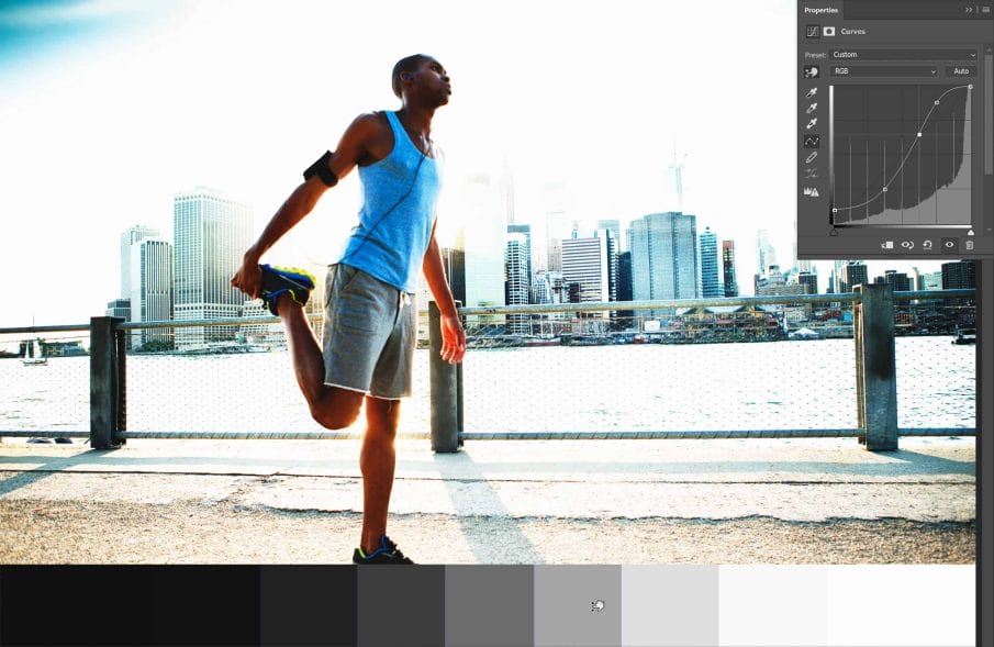
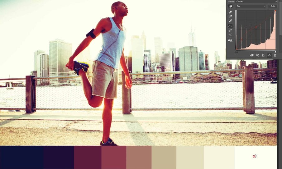
The true power of the tone chart comes when you’re using the red green and blue channels in your tone curve. Anyone who has used the RGB tone curves will remember when they first tried it and how it doesn’t make any sense at all. Everything seems sort of random. But because you have this tone chart now, you can see exactly what color you’re getting and where that color is appearing.
Tone Chart Photoshop Tutorial
So now that you know how this works, let’s learn how to create the chart.
Step 1
Instead of creating a bunch of rectangles, we’re going to add a black to white gradient. Go to the toolbar and select rectangular marquee tool.
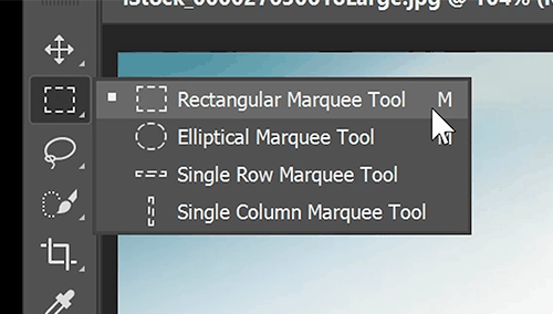
Drag to create a rectangular selection. You don’t need to make it as high as mine, but for this tutorial I’ll be making it larger so that the chart is easier to see.

Step 2
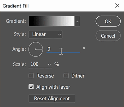
Now we need to add a Gradient Fill layer. You won’t find this in the adjustments panel because it’s technically not an adjustment layer – it’s actually a fill layer. You can find it in your Layers panel by clicking on this New Fill or Adjustment Layer button, and on the top you’ll find the Gradient fill layer. By the way, don’t confuse this with the Gradient Map, those are two different things. So make sure you’re adding a Gradient Fill layer and not a Gradient Map adjustment layer.

In the preset picker, select the black to white gradient. Change the angle to 0, click OK and you’ll get a horizontal gradient.
Step 3
Next, add a Posterize adjustment layer. You can find this in the same menu we used earlier in the Layers panel…. or by selecting it in the Adjustments panel. If you don’t see this panel, you can find it by going to Window > Adjustments.
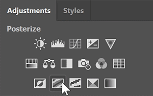
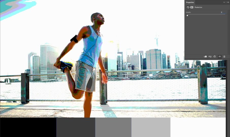
With this adjustment, you can limit your image to a certain number of tonal areas. For example, if we set this to 3, we’ll get black gray and white. If we set it to 5, we have blacks, shadows, midtones, highlights and whites. You can increase this even more if you want more control but generally I like to start off at 5. Also, always keep this an odd number, so like 3, 5, 7 or 15. This is because you always want a 50% gray color in your chart which targets the horizontal middle of your tone curve.

Step 4
Right now the Posterize adjustment is affecting the entire image. To make it only affect the gradient, click on this button here. This basically clips the adjustment to the layer below it.
Step 5
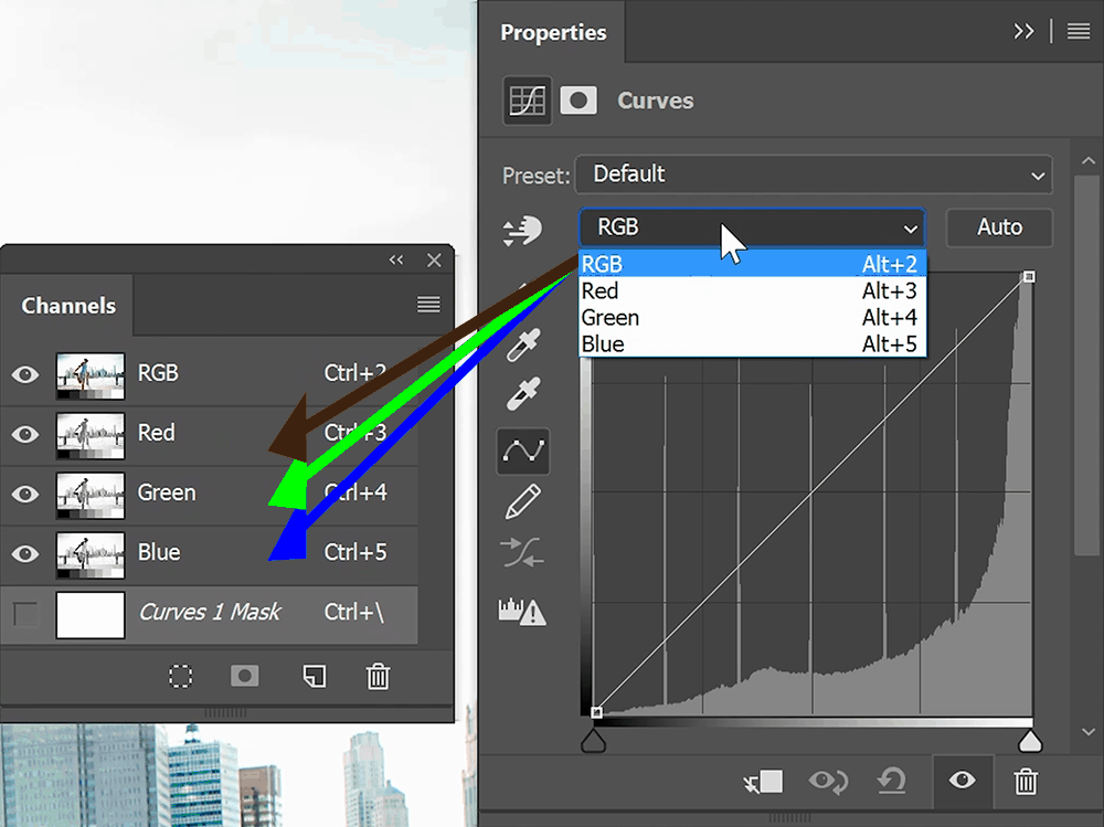
We’re done creating the gradient. Now let’s move to the tone curve. In your Adjustments panel, click on the Curves adjustment. Note that there are 4 channels in this tone curve, the RGB channel, red, green and blue. Basically the channels in this tone curve targets the channels in your image. So the red channel in the tone curve will affect the red channel in your photo. Same with the green and blues.
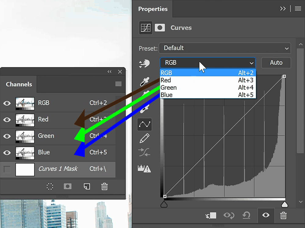
For the RGB channel, it’s actually affecting all three channels at once. If you don’t know how channels affect your image, then watch this channel contrast tutorial – it’s something everyone who uses the tone curve needs to know.
Step 6
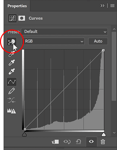
We’re done with the layer setup. Now it’s time to play with the tone curves. Let’s start with the RGB channel. Click on this button here to use the Auto-Select Targeted Adjustment Tool. This tool lets you create and change points on your tone curve by dragging the tonal area that you want to adjust.
Simply drag vertically to change the settings. As you do this, you’ll see it making changes in your tone curves panel. This is a great way to learn and understand how the tone curve works.
Step 7
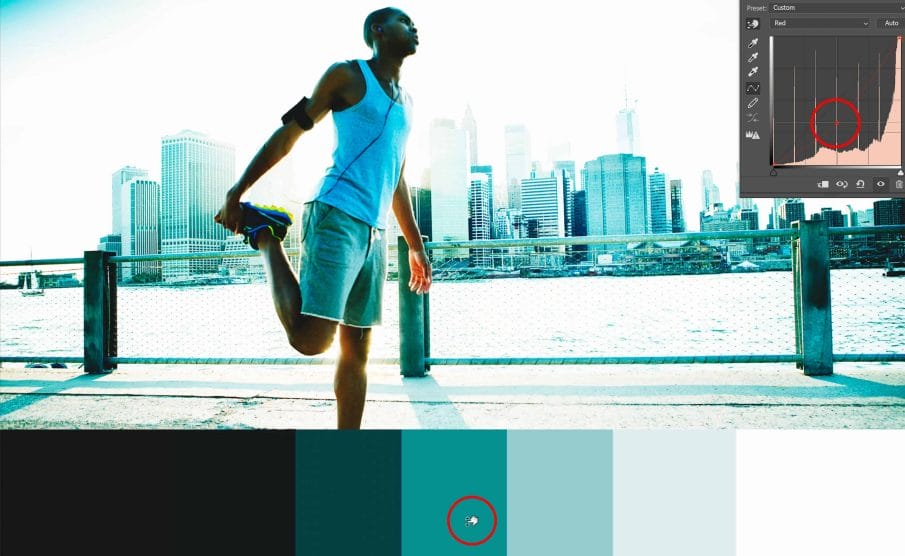
When you’re done, you can switch to the red green and blue channels. Select any one of the channels then try dragging on the middle of the chart to see what color you’ll get. For example, if we go to the red channel and drag this upwards like this, we’ll tint the image red.
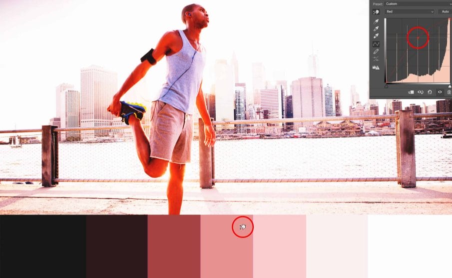
If we drag it down, we’ll tint it the opposite color which is teal. Keep playing with the settings until you get something you like.
Additional Benefits of the Tone Chart
So there you have it. You now know how to create effects using the tone curve. The tone chart makes using the tone curve easier and it also gives you a visualization of the effect you’re creating. But there’s also another benefit. If you look at your tone curve, you’ll notice that the horizontal position of your points are evenly spaced out. You can even go into different channels and the horizontal position will match. This is very important once you start getting into more advanced tone curve techniques.

Examples
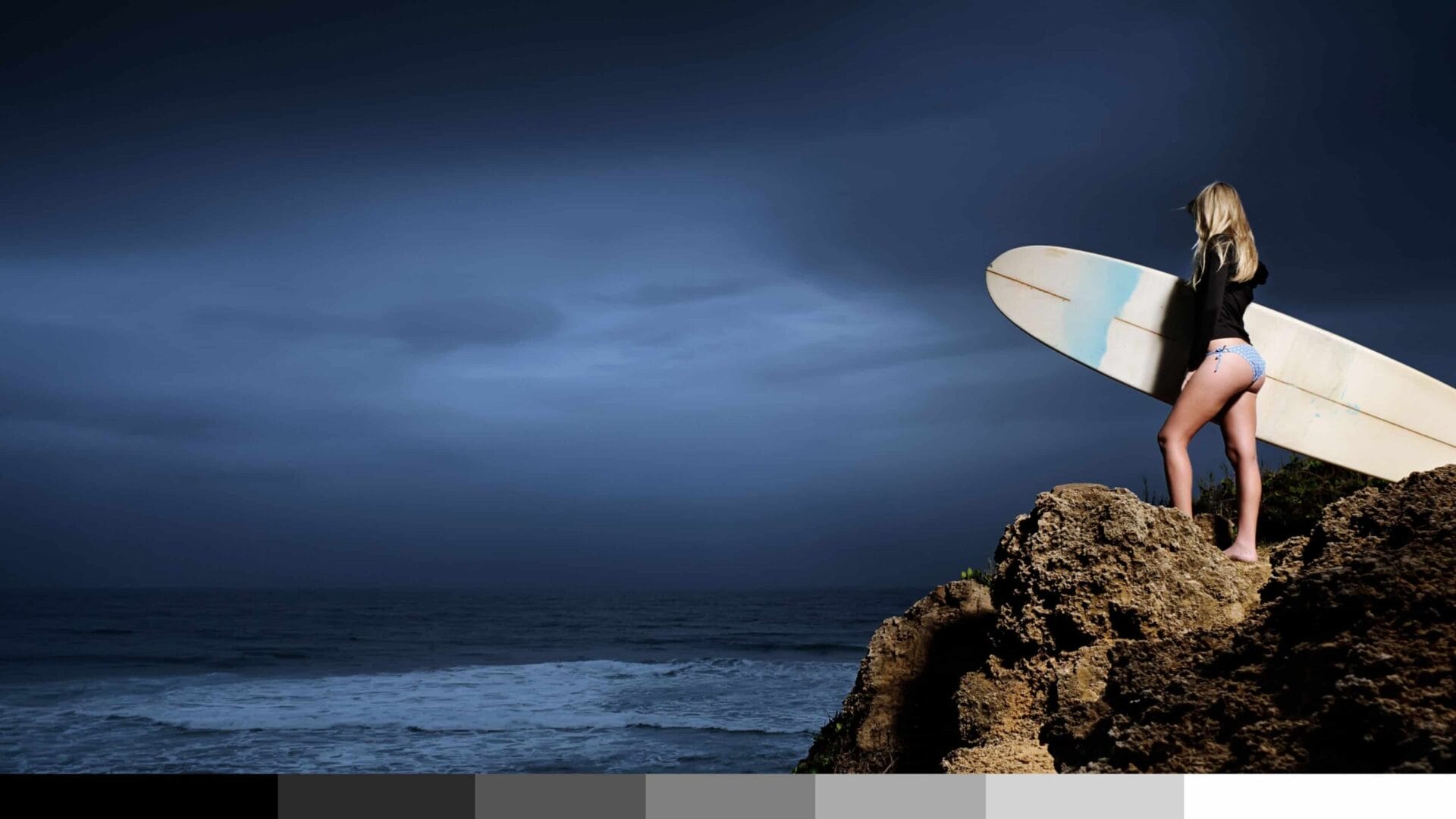
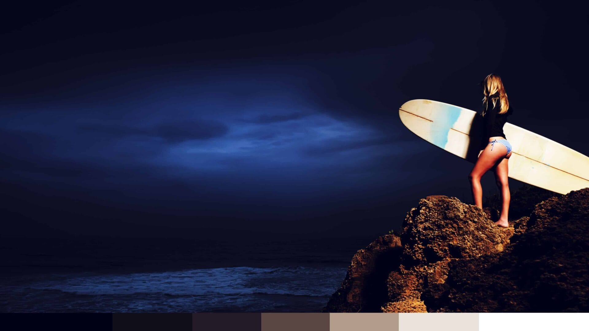
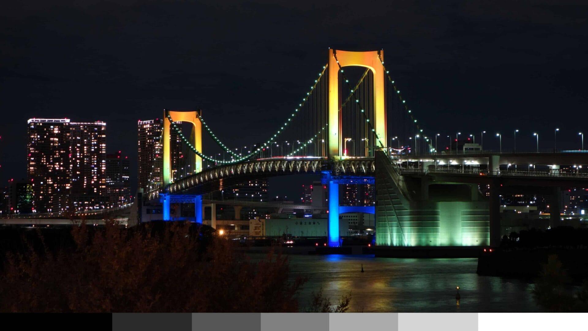
To end this tutorial, let me show you some examples of effects I created using this technique. I recommend starting off stronger (as shown in the examples below) and lowering the opacity afterwards – it’s much easier to fine-tune your results like this.



You do beautiful word and you are a wonderful teacher. I really like this written tutorial of the video I first saw on Youtube.
[…] skill that you can use in other software. If you want to learn how to use curves, check out my My Secret Tone Curves Trick tutorial. I have tons of tutorials and you’re going to find out that it’s not as hard as most […]