Learn how to create the popular orange teal look in Lightroom. This is a very easy tutorial it’s perfect for beginners. You’ll learn how to use the Camera Calibration sliders to shift the hues and use the Tone Curves create a simple faded look. This technique can also be used to create other similar warm and cool color combinations. For example, if you don’t want orange and teal, you can create pink and cyan. By the way, if you only use Photoshop, you can still follow along with the Camera Raw filter which is in the Photoshop filters menu.
Orange and Teal Lightroom Tutorial
Step 1
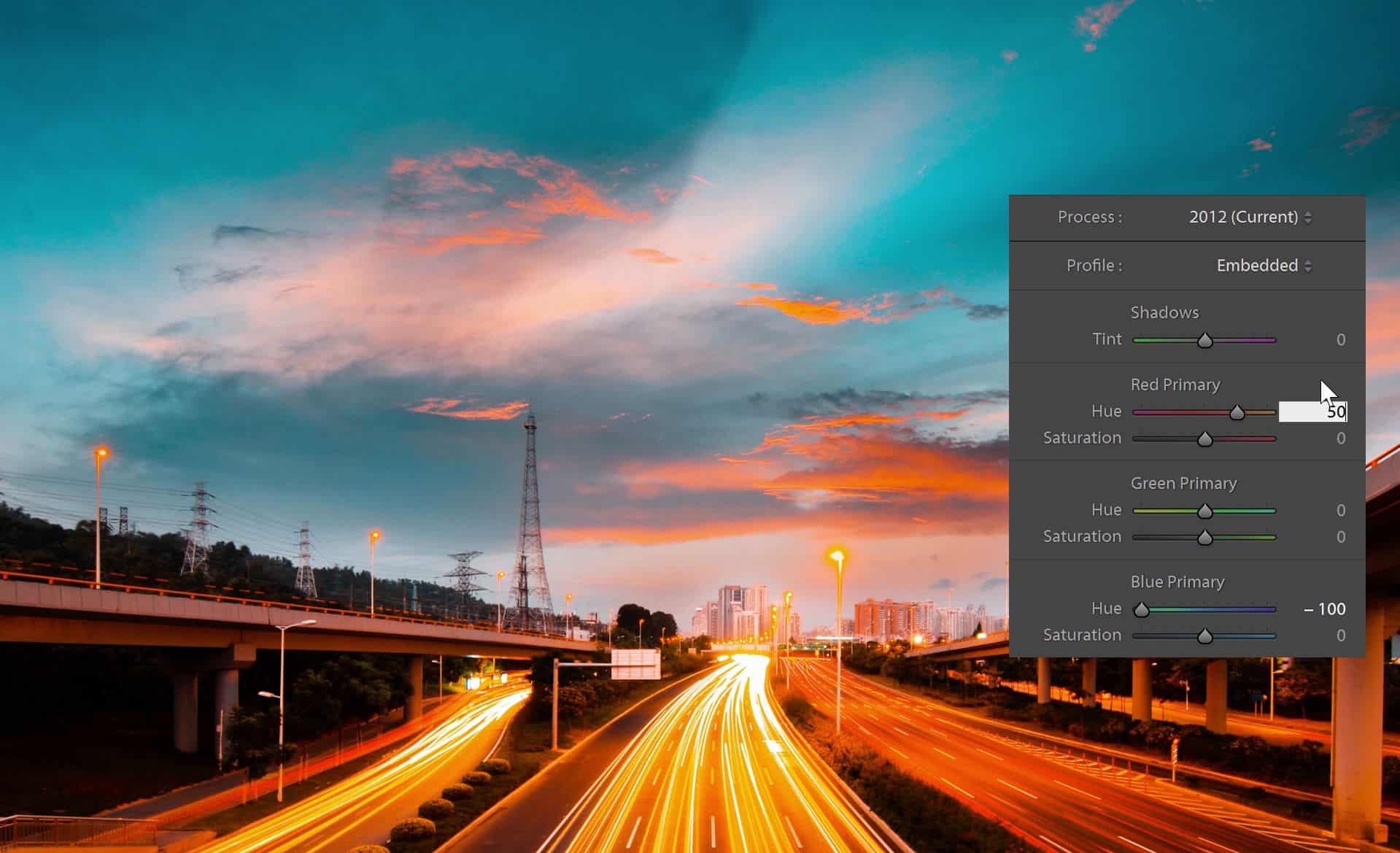
Start by going to the Develop module and scrolling all the way down to the Camera Calibration area. You can technically do this with the HSL sliders but it’s much easier and faster to do it with the camera calibration sliders. Here, set the blue hue to -100 and you’ll notice that you have the teal colors already.

For the oranges, shift the red hue to around 50. By the way, you don’t have to enter the exact settings and you can definitely play around with the saturation sliders as well. It all depends on the look you’re going for.
Step 2
We now have the teal orange look and some of you might say, “But it doesn’t look like the stuff I see on Instagram”. And it’s because people usually add some sort of faded look. Sometimes it’s an Instagram filter, sometimes it’s a film preset, and sometimes it’s just a simple tone curve. For that, go into the Tone Curve adjustment here. There’s two modes for the tone curve and you want to be in the Point Curve mode. If you’re not in this mode, just click on this button here to switch.
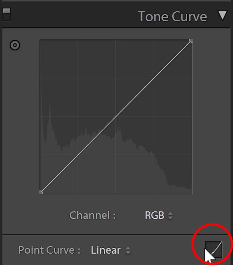
If you don’t know how to use the tone curves and you want to learn more about it, you can watch this tone curves tutorial. But the tone curves we’re going to create is very simple. And you can follow along just by imagining that the tone curve looks like shown in the image below. If we add a point to the middle here, it’s telling Lightroom to take this tone here, which is 50% gray and either make it brighter if we drag it upwards or darker if we drag it downwards. That’s just a very simplified way of looking at it to help you get through the rest of this tutorial.
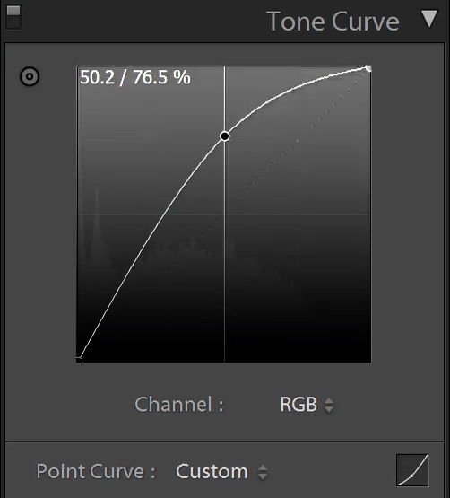
For the faded look, simply drag the bottom-right point towards the center. This will lift and crush the blacks giving you this flat look in the shadows. You can also do this with the top-right point which will do the same thing to the whites.
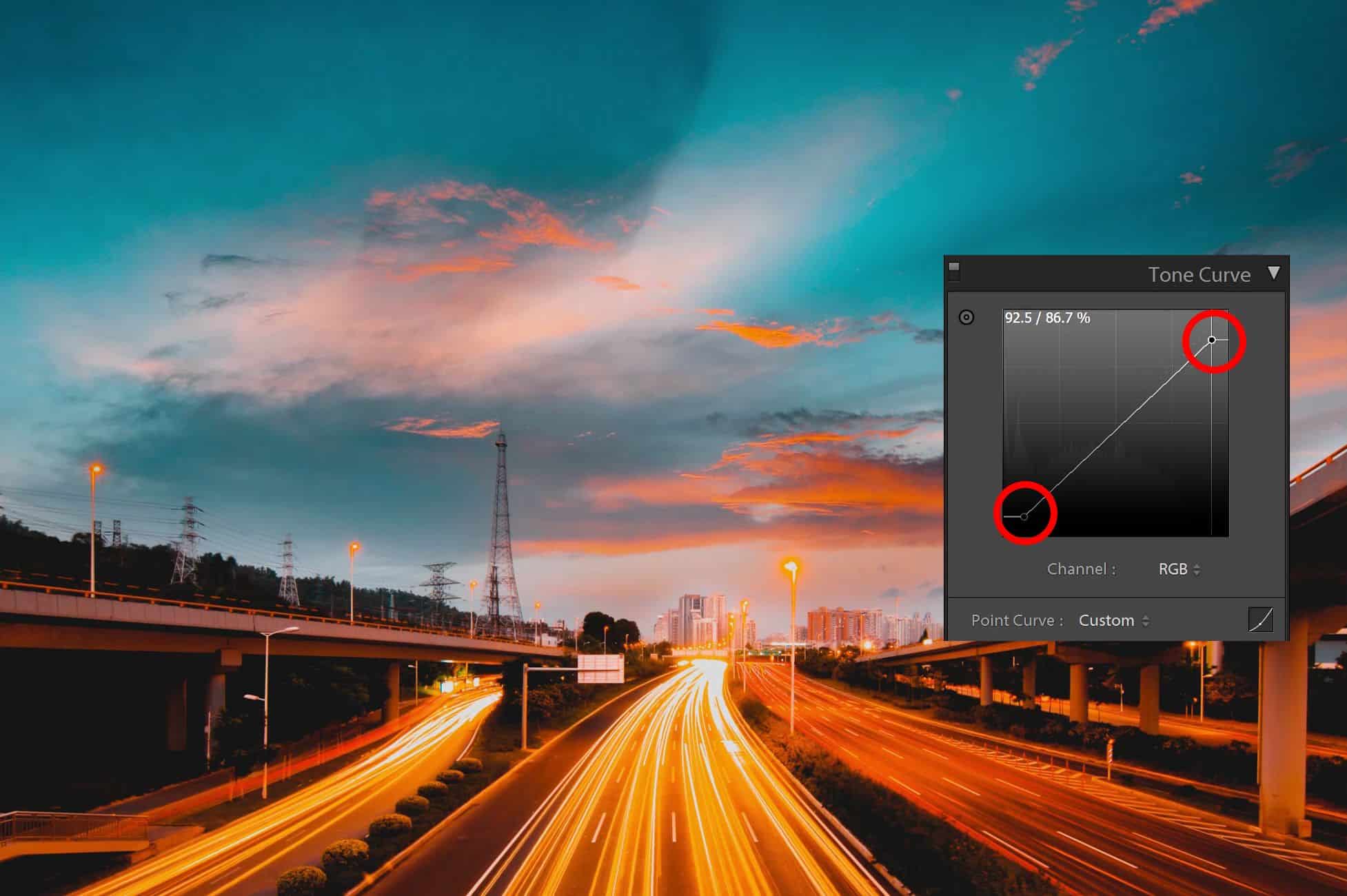
For the midtone contrast, you can create a very slight S-curve. I usually like to start off by adding a point right in the middle which will keep the midtones where they are. Then you can add one or two points around it to create an S-cuve like this.
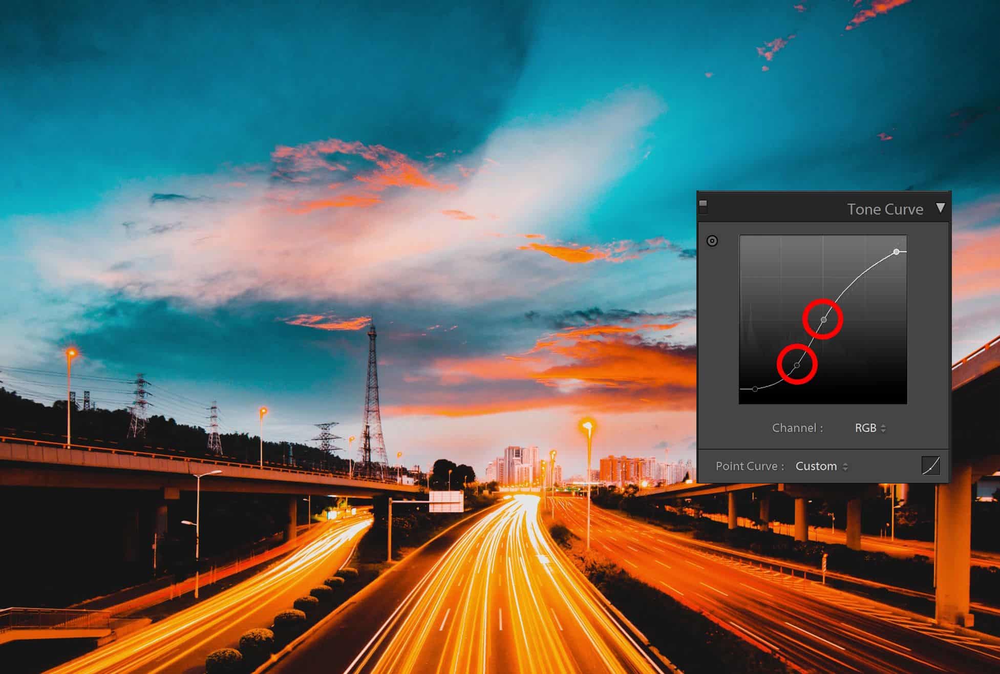
Final Results
And you’re done. Here’s how the image looks like before and after.


Creating Other Color Combinations
You can also use this technique to create other colors. Right before I was done writing the script for this video, I found a Reddit post where someone asked how to create a pink and cyan look. It’s hard to tell from this photo of a printed photo what the exact colors are but it looks like you can create with the same technique and different settings.
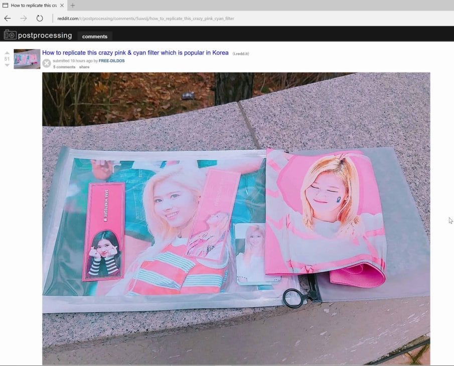
Basically instead of this orange and teal, it’s a pink and cyan. So by playing around, I was able to get something similar by setting the red hue to -100, saturation to -100 and if you need to, you can go into the HSL and increase the red luminance.
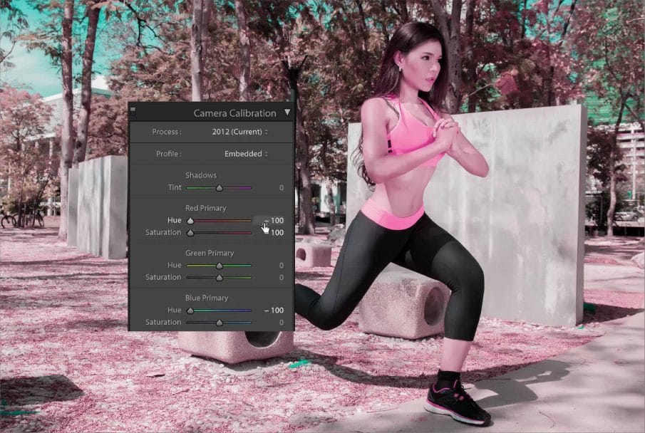
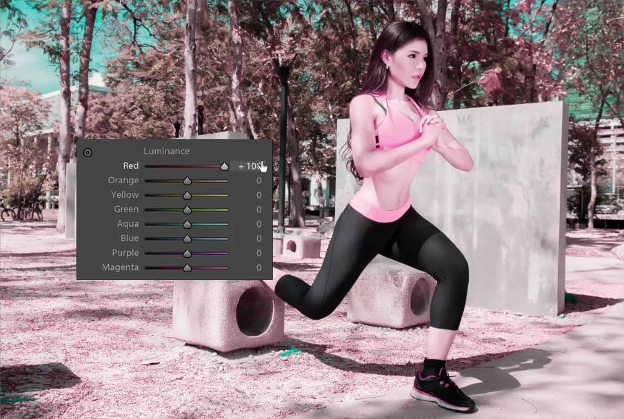
Here’s how it looks like before and after.
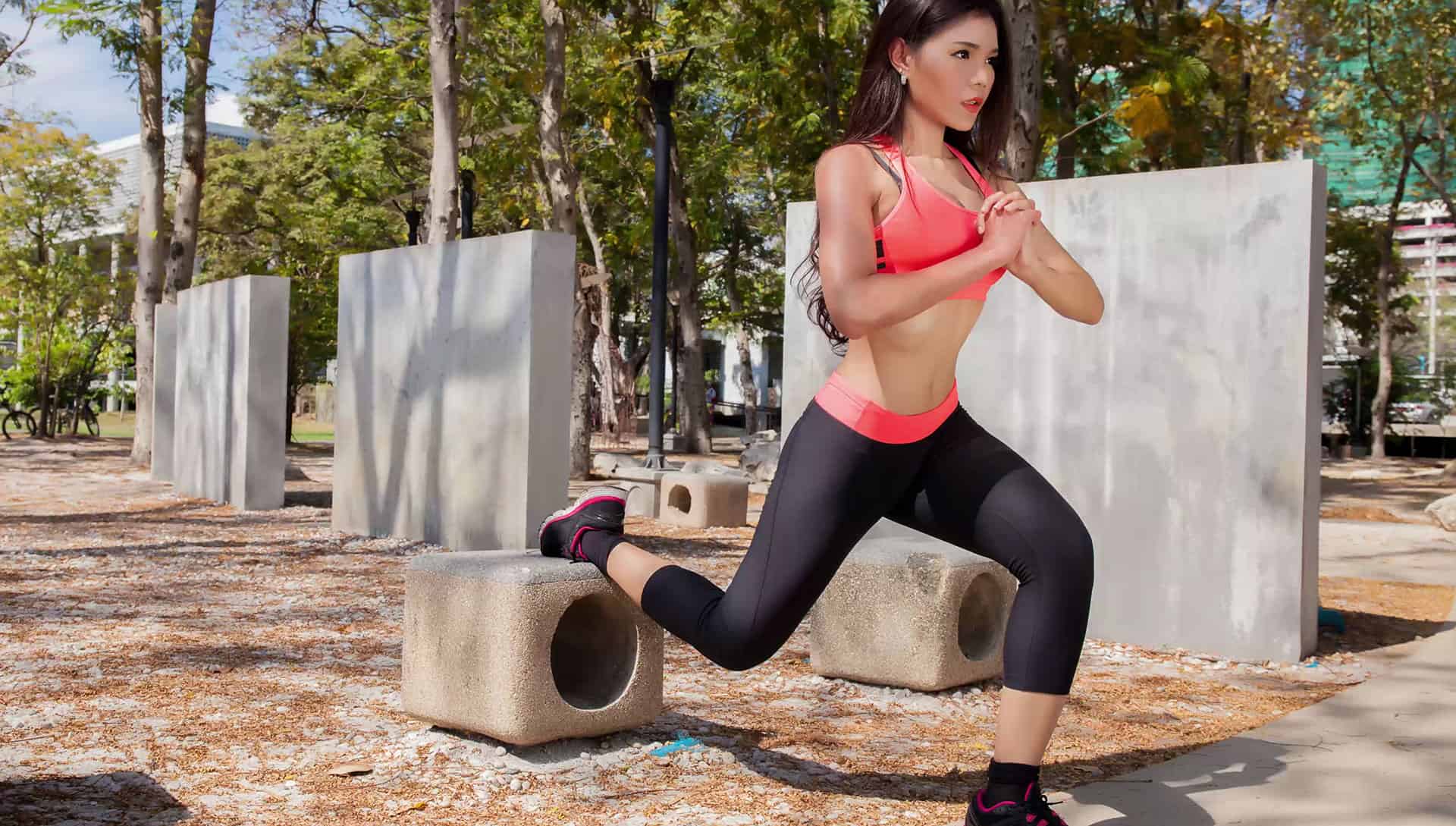
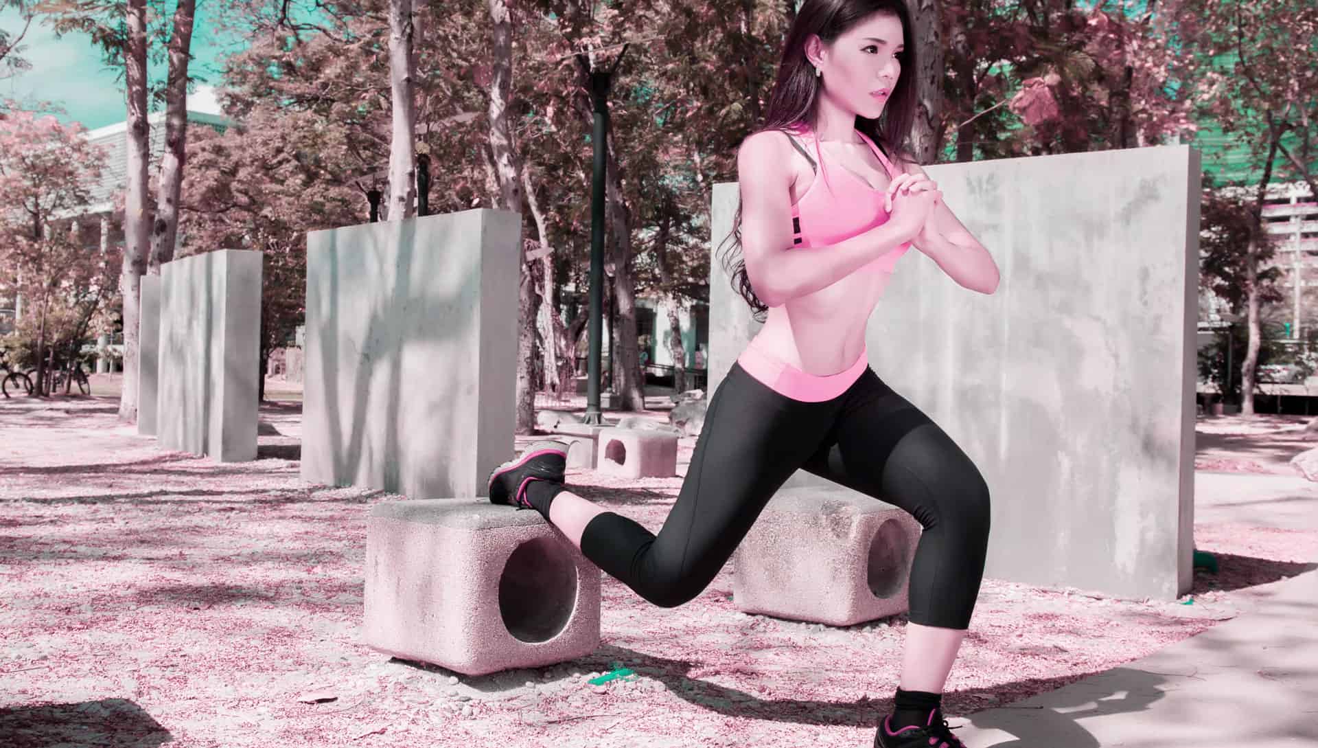
More Examples
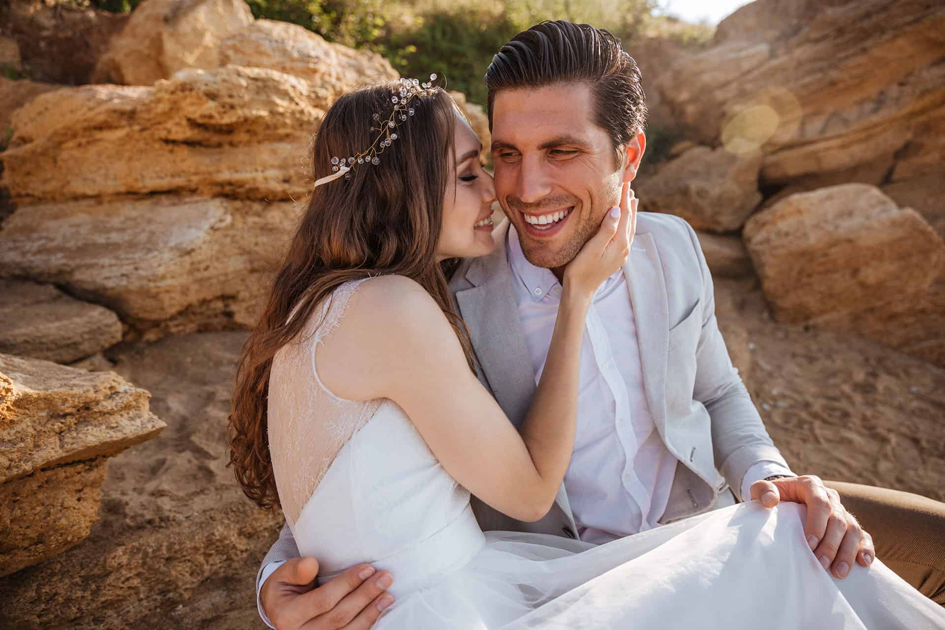
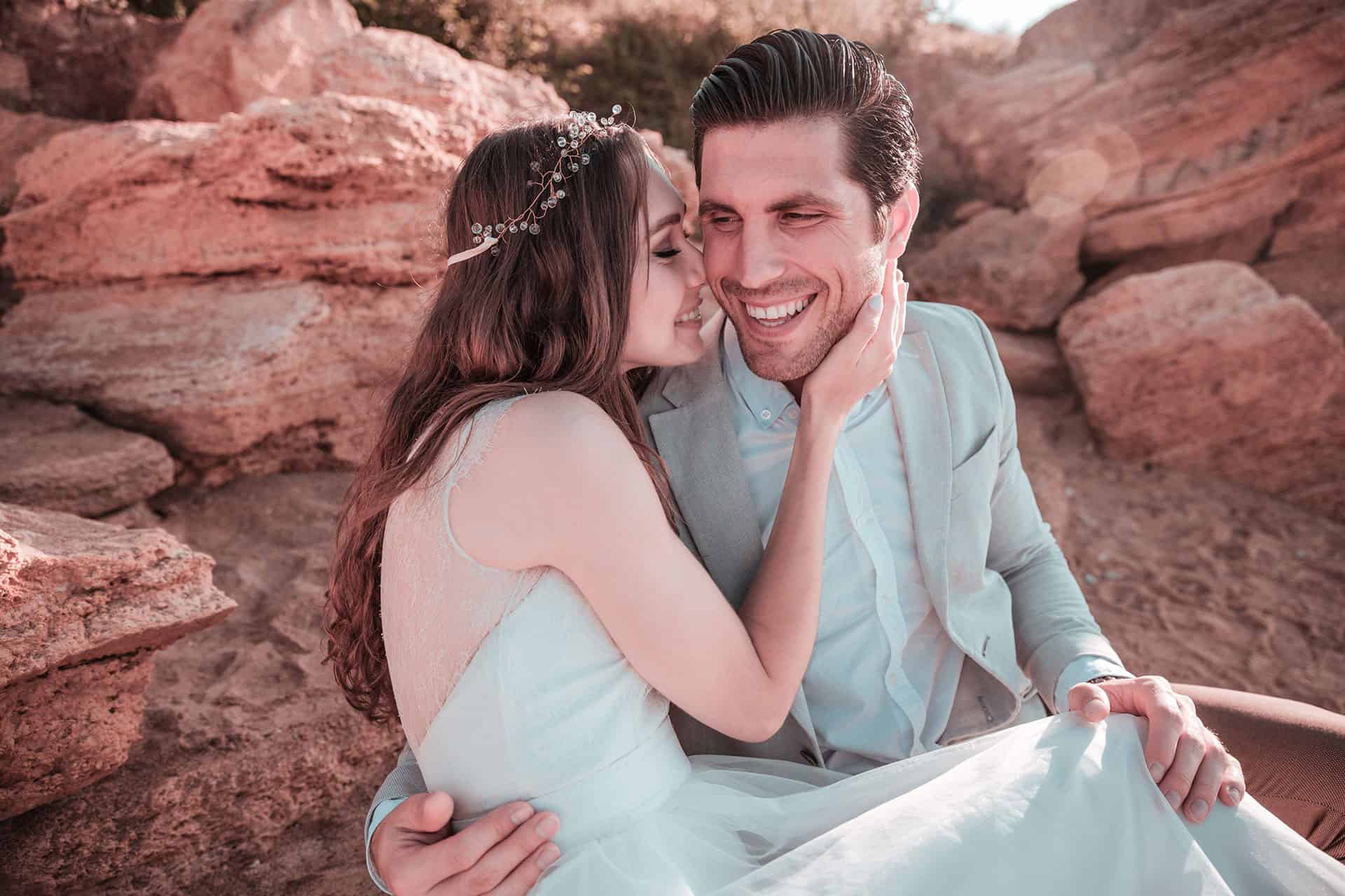
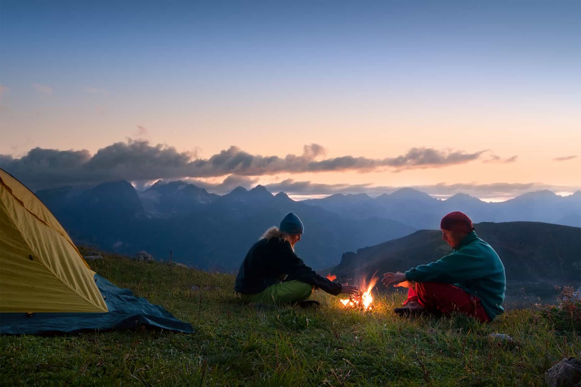
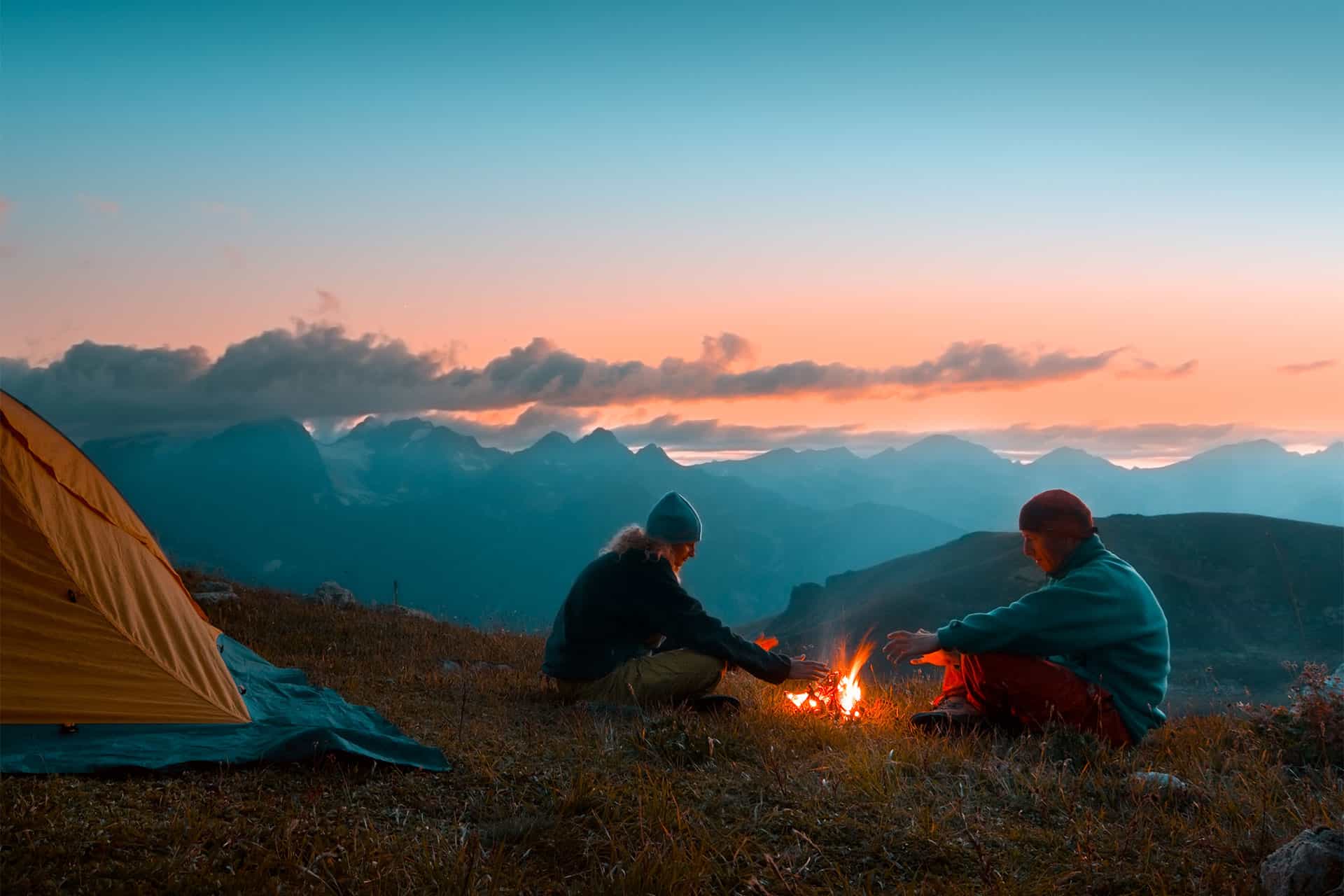
Here are some more examples of other photos processed using this technique.
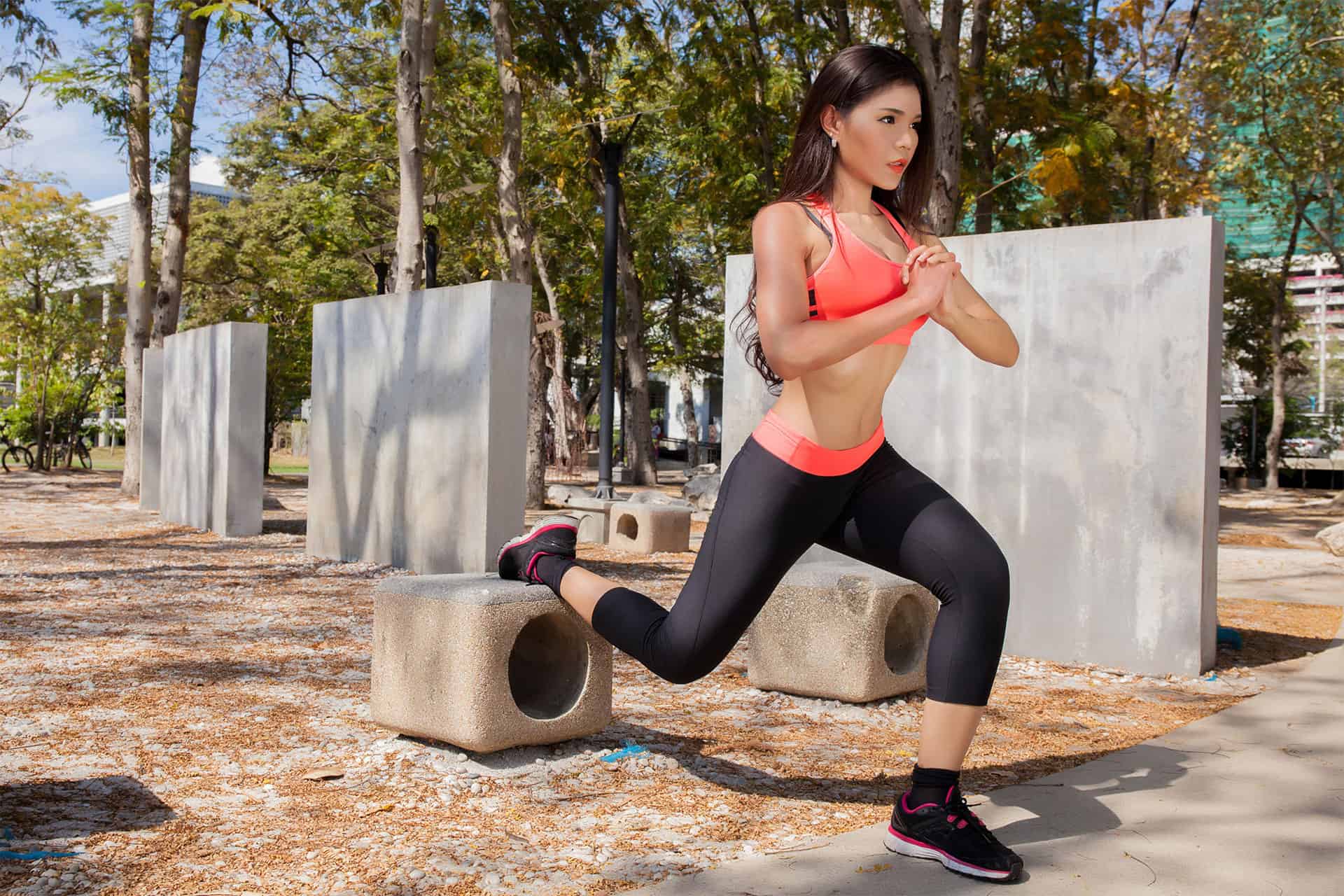
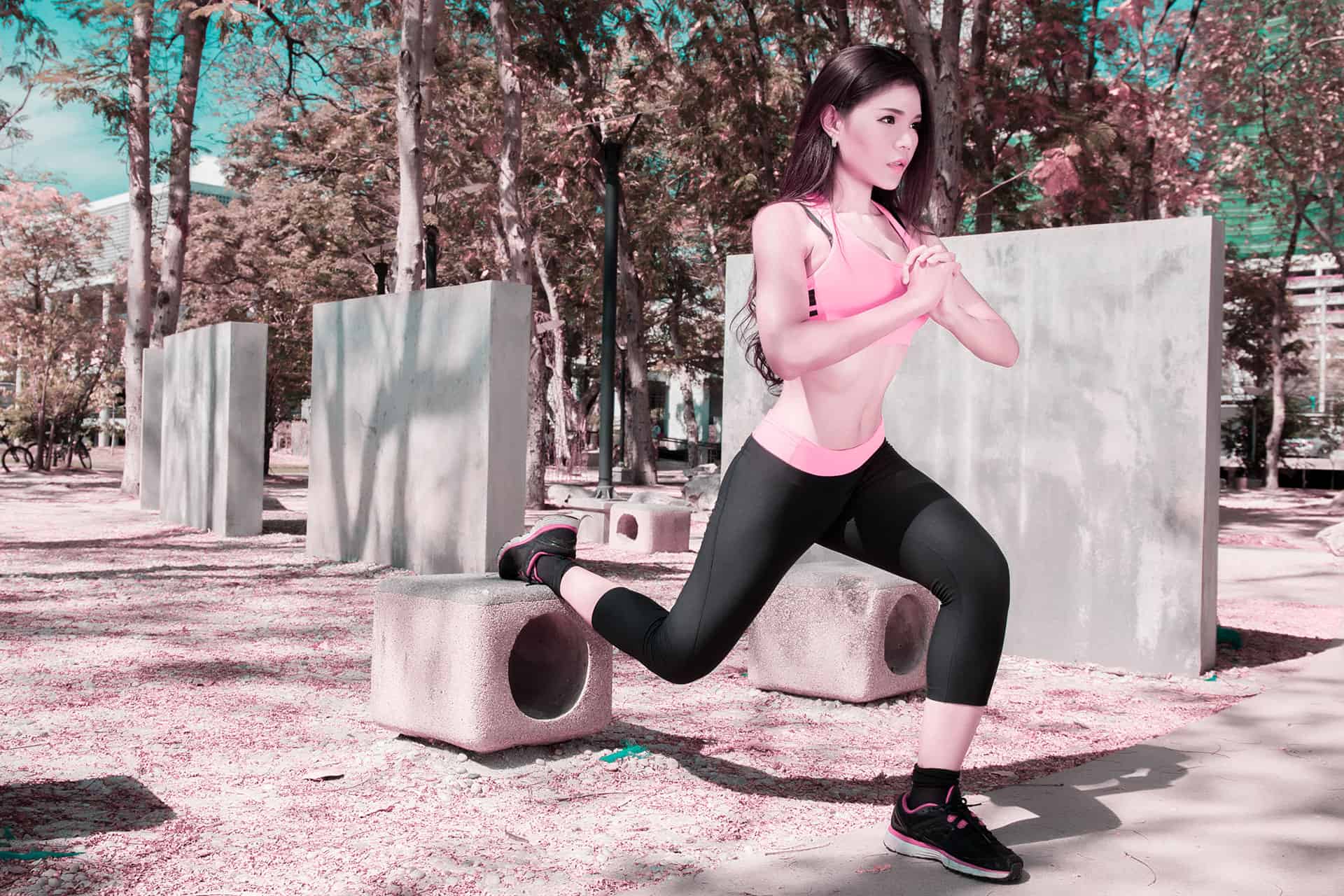





Great tutorial … very easy to follow, well illustrated, nice video. Thanks so much!