Learn how to create an orange teal look in Photoshop using just two adjustment layers. In a previous video, you learned how to do this in Lightroom which you can copy with the Camera Raw filter in Photoshop. However, if you’re doing it in Photoshop, it’s easier, more efficient, and more flexible to use adjustment layers. This is an easy tutorial so whether you’re a Photoshop beginner or expert, you’ll have no problems following along. What’s special about this tutorial is not the orange and teal colors, but the technique behind it. Because once you learn this technique, you can create so many different types of color gradings and color combinations with just a few layers.
Converting Your Image into Two Channels
A photo is made out of three channels, red, green and blue that when combined forms a color photo. For this orange and teal look, we’re going to start by converting it from three channels to two channels.
To do this, go to the Adjustments panel and add a Channel Mixer adjustment layer. If you don’t see this panel, you can open it by going to Window > Adjustments.

Here in the Channel Mixer properties, go into the Blue channel and set the Green to 100 and Blue to 0. This basically recreates your blue channel using the data from your green channel.

And if you go into the Channels panel, you should be able to see that the green and +blue channels look exactly the same.

So now your photo has two channels which creates this red and teal effect. By the way, this is also called the two-strip Technicolor look and is one of the very first forms of color film processing.


Shifting the Hue
Right now we have a red and teal look. To shift the reds to orange, we’re going to use the Hue/Saturation adjustment layer which you can add from the Adjustments panel.

Click on this tool here which will let you select any area in your photo and adjust the saturation.

There’s a trick to this tool and if you hold the Ctrl/Cmd key while dragging, it’ll adjust the hue instead of the saturation. So to shift the reds to orange, we can simply hold the Ctrl/Cmd key and drag on a red area.

Next, I’m going to drag (but this time without holding the Ctrl/Cmd key) on the orange and teal areas to adjust the saturation. This tool makes adjusting the hue and saturation very easy and I highly recommend getting in the habit of using it whenever you can.

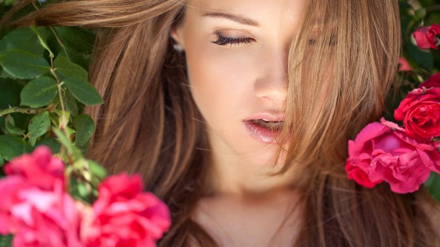
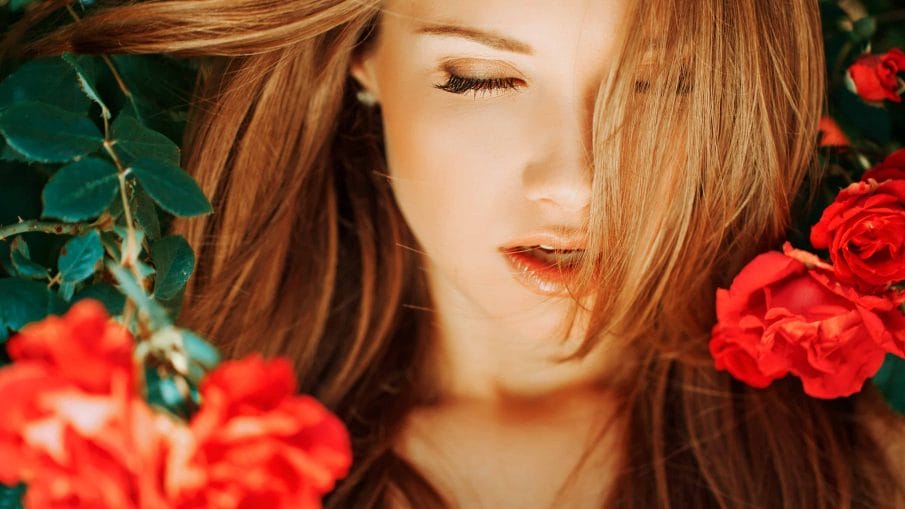
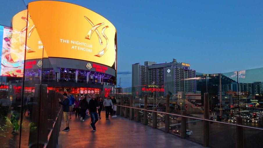
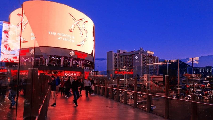
When you’re done, select the two layers by holding the Ctrl/Cmd key and then press Ctrl/Cmd+G to group them into a layer. Adjust the opacity to your likings and you’re done. Here’s how the image looks like before and after.

Other Combinations and Effects
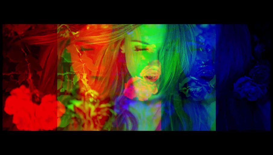
This technique can be used to create other color combinations. For example, by adjusting the hue, we can get a red and blue effect like this.

Or we can create a wacky green and purple effect like this. You can pick any color combination you like.

You can also go further and add a curves adjustment layer to change the tones. For example, if you want that faded contrasty look, you can drag the blacks upward and create a slight S-curve.

If you’re looking for something more vintage and romantic, you can add some warmth by going into the Blue channel and dropping the midtones. Whatever effect you want to create is up to you.

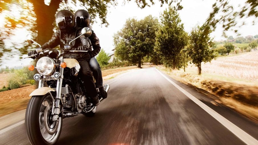
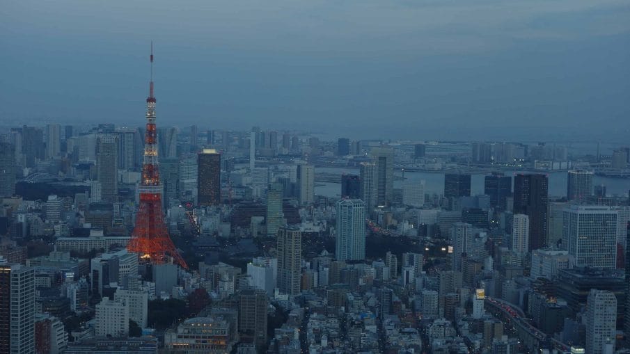
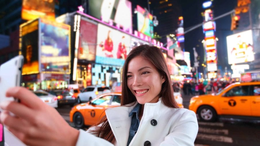
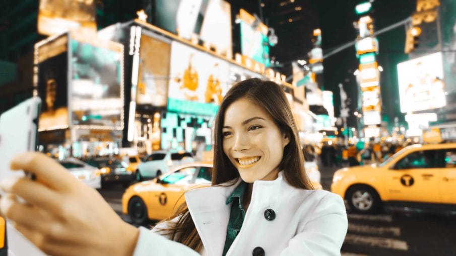
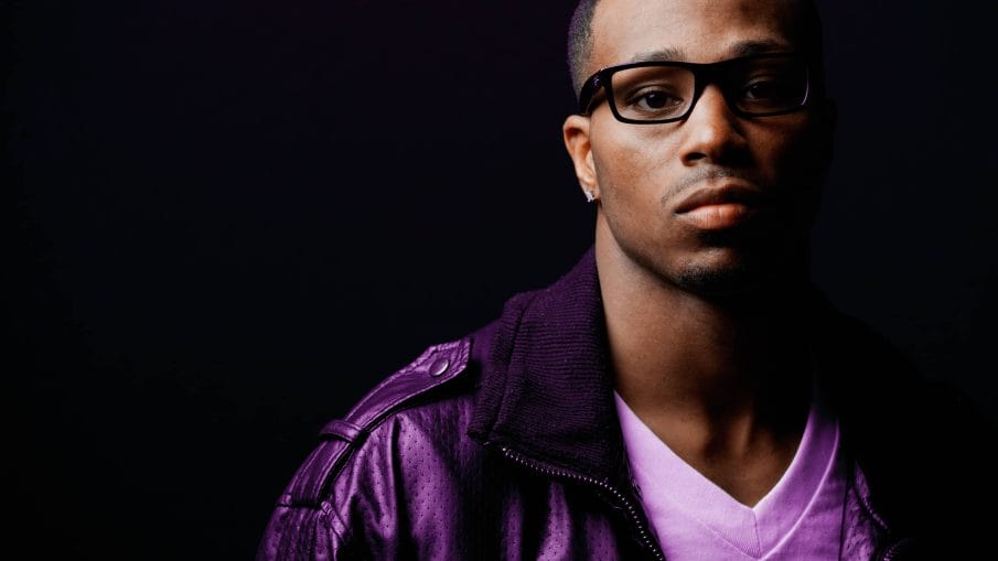
Here are more examples of what you can create with this technique. I know people have their own personal opinion on color gradings which is why it’s important to focus on the technique rather than the recipe. Because by learning this technique, you can create so many different looks and customize it to your own preference.







VERY GOOD, THANK YOU VERY MUCH, I LIKE POST