Hello and welcome to the second part of this series where you’ll learn how to replicate color grading effects. If you haven’t seen part one yet, make sure you watch that first. In part one, you learned how to match tones. But many color gradings are a combination of both tones and colors. So in this part 2 video, you’ll learn how to replicate colors from other photos. Compared to part one where you learned how to replicate tones, replicating colors a completely different process and that process is both harder and easier in different ways. You’ll see what I mean later. But if you’re ready, let’s start the tutorial.
Tones vs Colors
We already talked about the differences between tonal and color adjustments in the previous video. If you haven’t watched the first video, then make sure you watch that first. But as a refresher, tonal adjustments are anything you can do with the curves adjustment layer. Color adjustments are anything you can do with the hue/saturation adjustment layer.
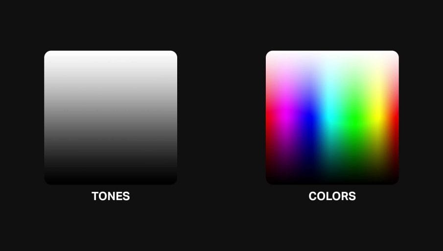
There are two things you need to know about color adjustments:
- You need to match the tones before you can match the colors. This is because colors can look very different after changing the tones.
- Colors are not as easy to match as tones. You’ll need to know what the exact colors are in the original photo.
Why do you need to know the original colors? Because, for example, here’s a photo with some color adjustments.
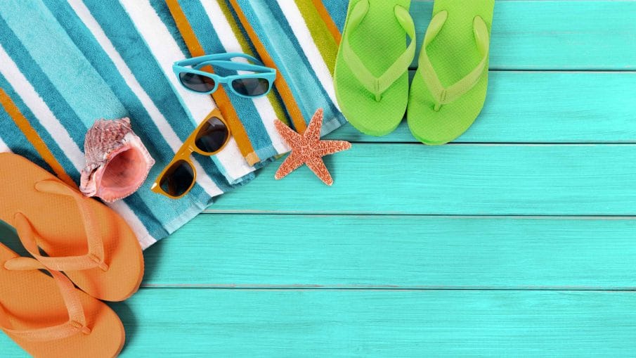
And here’s what the before photo looks like. Without the before photo, you wouldn’t be able to replicate the color adjustments because you don’t know what original color the sandals are. You don’t know what original color the wooden planks are. You have no reference to the original colors so therefore you can’t decode the color adjustments for this photos.
Picking the Right Photo
As we learned, not all photos can have their colors replicated. You need to know what the original colors are. As an example for this tutorial, we’ll be replicating some of Ben Thomas’s photos. His photos have a very unique color characteristic and it’s perfect for this tutorial because it’s much easier to replicate a strong color effect than it is with a subtle one. So if this is your first time trying to replicate colors, pick a photo with a strong color effect.
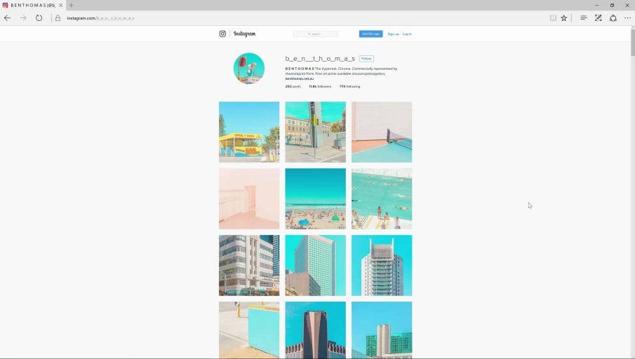
But you can’t just pick any photo to replicate. The first requirement is that it should have lots of colors. This is mandatory. A photo like this one right here has very few colors so we’re not going to be able to match the entire spectrum of colors.

However, this photo here would work because you have more colors to work with. You have the reds from the sign, greens from the grass, and blues from the sky.

The next requirement for picking a photo is that it needs to have something identifiable so that we can do a search on Google to find a similar photo that’s unprocessed. This photo here, eventhough it has a lot of colors, it’s not the best photo to work with because it would be hard to search for an unprocessed photo of this on Google.

So I’m going to scroll and find something like this. Here’s a picture of a gigantic Gundam statue and this is the perfect photo because it’s probably easy to find an unprocessed photo of this on Google and it has lots of colors.

Replicating the Colors
Step 1
Just like with part one of this series, to replicate the effect, we need the before and after photo. If you can’t find the before photo, you can try fixing the colors yourself to create a fake before photo but most of the time it’s far easier to just find an unprocessed photo on Google.
To find the unprocessed photo, I’m just going to do a search for the Gundam statue. And since we have a lot of results here, I’ll filter it so that it only shows large images. You want to avoid small and heavily compressed images because when you start to manipulate the colors, it’ll get really pixelated and the colors will look glitchy. So try to find something that looks pretty decent. This photo here looks great so let’s use this one.

Step 2
Load the two images into Photoshop and place them in the same document but on their own layers.

Step 3
The first thing you need to do is what we did in the part one video where you replicated the tones. If you haven’t seen that yet, make sure you watch it first. You’ll want to apply the same tonal effect to the unprocessed before photo so that it has the same tones as the processed after photo.
But I didn’t do that yet for this photo. And it’s because I want to share with you a tip which is that sometimes you can totally guess the tones. If you’re an experienced photographer, you can look at this after photo and already guess what was done to get the same tones. And it’s probably a simple Lightroom adjustment.
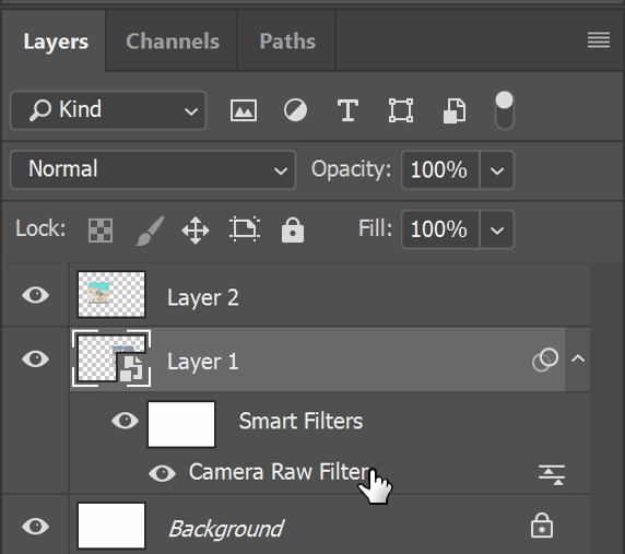
If you want to use the Lightroom adjustments in Photoshop, first convert the layer with the unprocessed photo to a Smart Object by right-clicking and choosing Convert to Smart Object.

Next, go to Filter > Camera Raw Filter. And then make your adjustments here. And to get the flat look, you’re basically lowering the contrast with the tonal sliders like this:

Step 4
Now the tones on both layers are pretty much the same and we can start replicating the colors. For the colors, you can either use the HSL adjustments in the Camera Raw Filter or you can add a Hue/Saturation adjustment layer.
So which one should you use? If you want to create a Color Lookup file from this so that you can use it in other software like Adobe Premiere and Media Encoder, then add a Hue/Saturation adjustment layer.
If you want to copy and paste the color values to Lightroom, then use a Camera Raw Filter. I’m going to use the Camera Raw Filter since I already have it setup here.
Step 5
The next step is self-explanatory. All you need to do is adjust the hue, saturation and lightness to match the of the processed photo. For example, the blues are more of a teal color. So I’ll shift the hues like this.
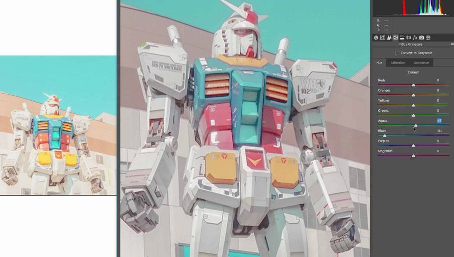
Next, I’ll adjust the saturation and lightness until it matches.

Step 6
Keep doing this with the rest of the colors.
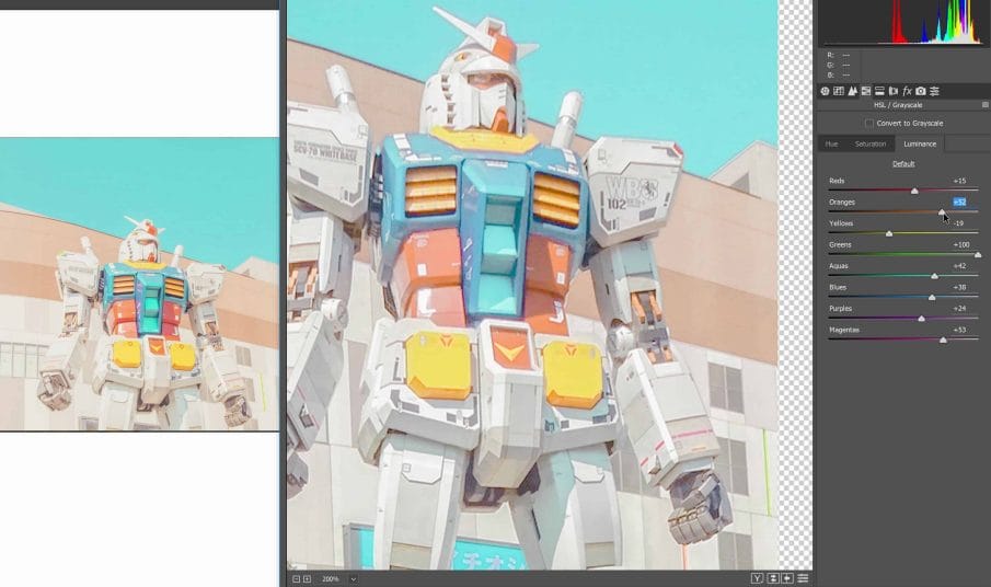
Final Results
Anyways, I’m done matching the colors. Save the settings and then try it out in other photos. Here’s are some before and after examples of this effect we just replicated.


Practice Makes Perfect
This process isn’t as straightforward as matching tones. But with practice, you’ll be able to do this faster and most importantly, you’ll get a better understanding of colors. For example, you’ll be able to look at a processed photo, know what colors changed, and which direction the hue/saturation/lightness were shifted towards.
Keep in mind that the Photoshop techniques you learned part one and part two are not one-size-fits-all techniques. Many times, you need to adapt from it but being able to match tones and colors with these techniques will give you a great head start.
And if you’re going to be practicing these techniques, go to /r/postprocessing and try to replicate the looks from there. Not only are you getting practice, you’re also helping people out and maybe you’ll get some reddit karma from it. So it’s a great way to do two things at once.
