The tone curve is one of the most powerful tools that every photographer or retoucher needs to learn. But it never had a major redesign. And most people still think it has a steep learning curve when really it’s quite straightforward. With a simple redesign, Adobe and other software developers can make the tone curves much more intuitive to the point where even if it’s your first time using it, you’ll be able to guess your way around it. In this article, I’ll show you 5 improvements to the tone curves that software developers like Adobe should make. And in the process, you’ll also learn cool new ways of seeing and understanding the tone curves which will make everything so much easier.
1. Make it Bigger
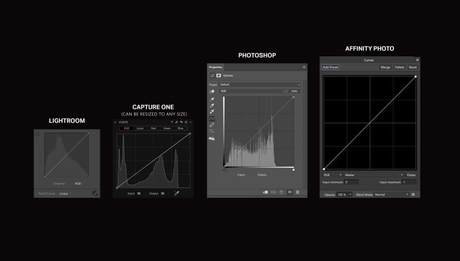
The first step software developers need to do is make the tone curves bigger. Adjusting the tone curve requires a lot of precision. And when you look at the tone curves in Lightroom and Photoshop, they’re tiny. The tone curves in other software like Capture One and Affinity Photo are much larger giving you more precision and ultimately making it easier to use.
2. Add a Background
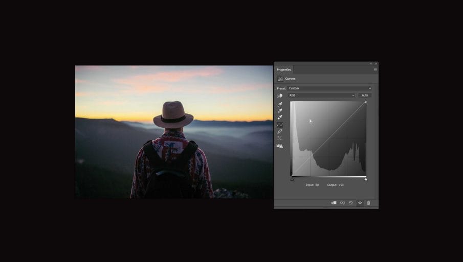
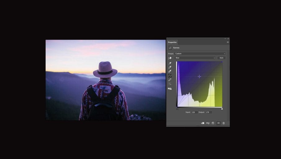
When people first see the tone curves, it doesn’t make sense at all. It’s not a tool you can figure out how to use at first glance. But there is a way to make that possible. And here it is. Simply add a background to the chart. So if someone adds a point to the line and repositions it, they know what is happening. And this is especially powerful when using the red, green and blue channels. For example, if we go into the blue channel and add a point in the middle like this. You’ll know that if you move it up, it’ll tint your image blue. If you move it down, it’ll tint it yellow. This is a simple change that I think should be standard in every software.
3. Channels Preview
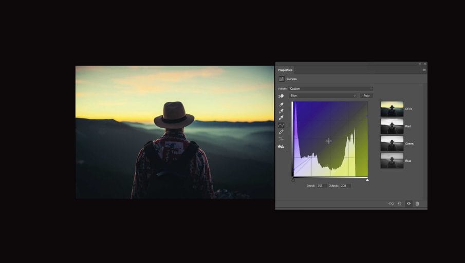
So when you’re adjusting the red, green and blue tone curves, what exactly are you doing? The answer is that you’re adjusting tones in the individual channels of your photo. In case you don’t know, a photo is made from three channels – a red, green and blue channel that when combined, forms a color image. When the balance of these channels change, for example if you make the red channel overly bright, it’ll add a red tint to your photo. If you edit the tone curve in the RGB channel, you’re actually changing all three channels at once. And because you’re adjusting all three channels equally with the same tone curve, there’s no change to the balance of your channels which is why you don’t get any color tints. If you want to learn more about this, you can watch this tutorial which teach you how to create retro effects by manipulating the channels.
A simple way to help people understand this is to add a live preview of the channels like this. And with this feature, you should be able to see how your tone curve is affecting the channels in your photo. This is especially useful if you’re doing things like color correction.
4. Always show the individual channel tone curves
When you’re editing the RGB channel in the tone curves, you’re able to see the red, green and blue curve in the background. However, this isn’t present when you switch to the individual red, green or blue channels. And this becomes a problem if you want to get the tone curves to match. For example, if you want to add the same S curve in the red and green channels to create a cross-processed look, it’s really hard to get them to match up. You’ll need to go back and forth a lot to get the right settings. Or another way of doing this is to copy and paste the input and output values of each point which is a lot of tedious work. However, if the tone curve was designed to always show the tone curves of the individual channels, then this would be an easy task. But for now, you just have to stick with the traditional way of copying and pasting the input/output values.
A simple way to help people understand this is to add a live preview of the channels like this. And with this feature, you should be able to see how your tone curve is affecting the channels in your photo. This is especially useful if you’re doing things like color correction.
5. Grid Snapping
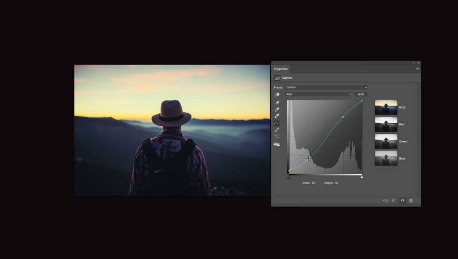
Finally, the last improvement I have for Adobe and other software developers is to have an option for grid snapping. As mentioned earlier, getting the points to match up in the exact same position on in multiple channels is hard to do. And if you get any points off even slightly, you can end up with rough tones like this.

With grid snapping, the points will snap to the grid in the background making it easy for anyone to create complex RGB tone curves.

Thank You for Reading
And there you go. Those are my tips for software developers out there who want to create a better tone curves tool. And if you do, thank you so much for that because I think a lot of people would find it very useful. But if you’re not a software developer like me, hopefully these tips will give you a better understanding of how it works.

How did you add the channels preview inside the curves panel?
Hi Edwin. This is an imagination of how the tone curves should be designed… it’s not actually available in Photoshop.